Shapes
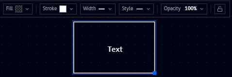
Rectangle, Circle, and Triangle (found under Basic in the Tools panel) place a basic shape on the canvas. All three share the same floating toolbar, shown here on a selected Rectangle:
The same toolbar on a Circle and a Triangle:
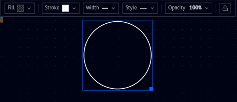
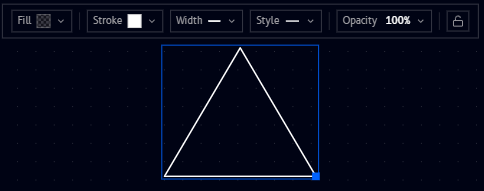
From left to right, the toolbar offers:
| Icon | What it does |
|---|---|
| Fill | Set the shape's fill (background) color, or leave it transparent |
| Stroke | Set the shape's outline color |
| Width | Set the outline's line width |
| Style | Set the outline's line style (solid, dashed, ...) |
| Opacity | Set the shape's overall opacity, from 0 to 100% |
| Lock icon | Lock the shape in place on the canvas |
Fill and stroke
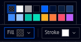
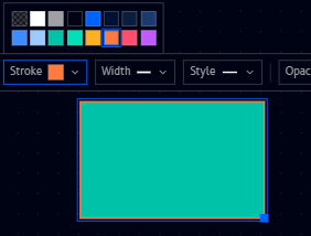
Fill sets the shape's background color (or the checkerboard pattern shown for no fill/transparent), and Stroke sets its outline color. Both open the same palette of preset colors:
A teal fill with an orange stroke:
Width
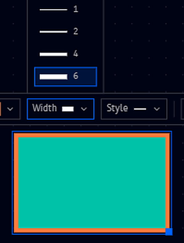
Width sets the outline's thickness, with presets of 1, 2, 4, and 6:
Style
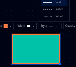
Style sets the outline's line pattern: Solid, Dashed, or Dotted:
Opacity
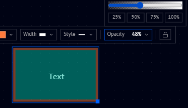
Opacity fades the whole shape (fill, stroke, and label together), from 0 to 100%, with quick presets at 25/50/75/100% or a draggable slider for any value in between:
Adding a label
Typing while a shape is selected adds a text label centered inside it (shown as "Text" above), styled using the same options as a standalone Text box.
Resizing
A selected shape shows a small handle at its corner (the blue dot in the screenshots above). Drag it to resize the shape, keeping the label centered inside as it grows or shrinks.